I’m not sure what has happened lately, but it seems a new hype in user interface design has arrived: sorting the different windows horizontally. Let me give you a few examples.
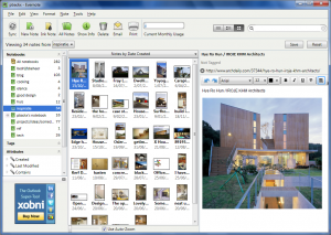
First there is the new Evernote:
Now I love Evernote and this 3.5 version of their Windows client is a huge improvement over any previous one. It’s just the default layout I’m not entirely comfortable with. I like the thumbnail browsing of notes, especially if it is a pretty visual category like the one above. What I like less is the position of the different panes. If I’m editing a post, I am restricted to the right hand side of my screen and I always tend to glance to the left and get distracted.
It’s caused by years and years of reading books: left to right and then back all the way left. I’ve grown accustomed to navigation panes on the left, but now, prime screen real estate (right there in the center of it all) is used by a secondary navigation pane. I didn’t see this coming, but it turns out to be pretty distracting for my easily distracted self.
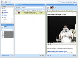
And then I got an invite to Google Wave (thanks!) and look what I saw:
It’s the same thing. The most important part of the screen is used by a list that you only glance at from time to time. I was a little worried, but I discovered, you can minimize list screen, which is a great thing. It moves the list to a popup that is accessible from the top. Exactly where it should be.
One important note before I ask your opinion: I’m running those applications on a 4:3 screen. I see a lot of widescreens lately, I’m sure this problem is a lot less pronounced when you have more horizontal space. But that doesn’t take away from the fact that people (in the Western world at least) tend to read top to bottom and left to right, which this new horizontal interface hype does not model very well.
So, what do you think? Is your monitor wide enough and/or are you young enough to not be bothered by this?

